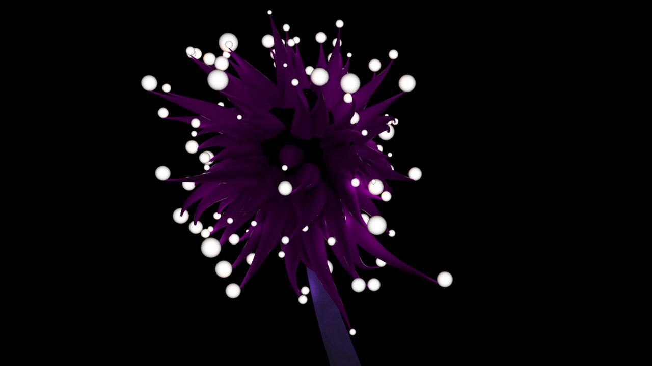
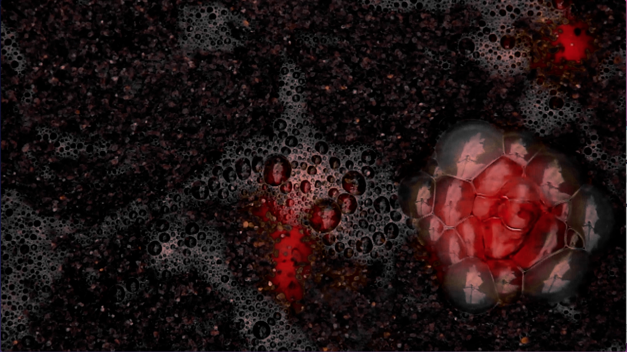
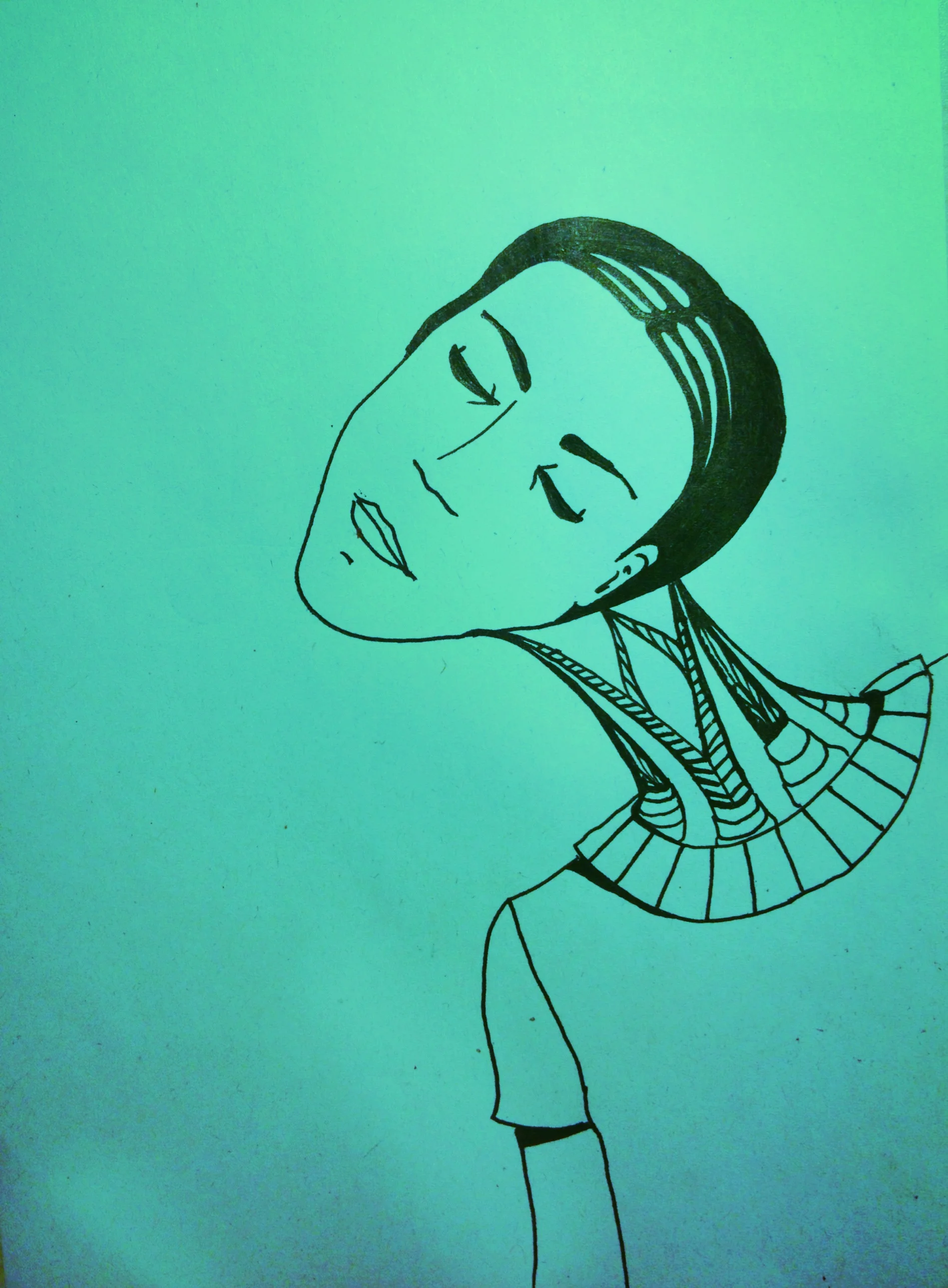
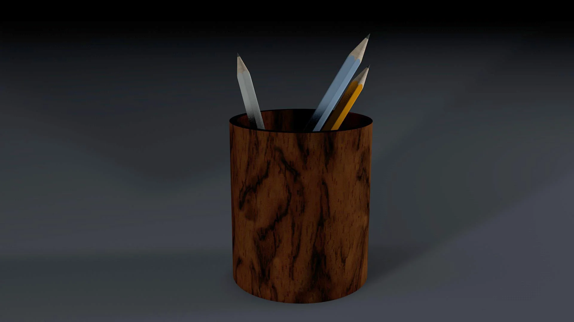
Character Modelling in C4d

So.. I just started making "Lawrence" without having much of an idea what I was doing! Weird process for sure. Completely opposite to when I was creating Ava (my Maya character). Tricky, kinda stupid - but lots of fun!

Here are some screenshots showing the progress throughout and where I've gotten to. I'm loving him! Can't wait to be able to animate :) You can also see a sneaky pic of Errol Flynn in there being a hair model ;)

Building a Scene

I thought I'd set myself the challenge of making a 3d animated character in Cinema 4d. I've only tried it once before and that was in Maya but I'm hoping to transfer the skills I learnt during that experience over into skills in Cinema. 

I started by modelling the environment, little bits at a time, to get used to the modelling tools before starting on a character. I had an old Banker's lamp model that I'd created a year before when I was just messing around teaching myself cinema and I patched it up a little but still now I can see that it might have been better if I started again with it. It's soooo heavy. Way too many polygons :( Anyways, above are some of the elements I've modelled or adjusted for the scene.

Swiss Army Knife - lovemarks & interactive reading

Swiss Army Knife

Lovemark = a brand that people LOVE.  

We were to design a tablet magazine for a well loved brand with a strong fanbase. The idea was to make it an experience. I worked with Jonathan Jungløv & Hodja Berlev to put together an app for Swiss Army Knife, where you could swim, drive, slide through some of the best user submitted stories on their website. Above is a little snapshot of some compositing I did for one of the stories. 


Designing a book cover and practicing compositing

In our first year, we were given a book to read in order to design a cover for it - the idea was use it as an opportunity to practice our photoshop compositing skills. When reading the book I was struck by a passage where the protagonist talked about painting himself into a corner with the girl he is in love with. It was striking and it was a way to work with strong "superhero" colours while still portraying the reality the story is based upon. Below you can see the elements I used to bring the final product together.

Robert Abel - The 3d god of the 80s.

During a motion design course in our 1st year, we were asked to research a specific motion designer. 2 graphic designers and myself got the awesome Robert Abel. The creator of this gem:
http://www.youtube.com/watch?v=hl2lhtBIt2E
among other brilliant glowing pieces of 80s graphics. This is a hidden video on vimeo because I'm not particularly proud of it, but I learned so much from the experience, so I think it belongs here. I really enjoyed working with the textures and the colours and it's a fun song by 80s inspired Cut Copy.

Sports Plus - Editorial Design

This past week we've been trying to rethink sports sites. My group's concept was to design a sports website with as little or as much information as the user desires. No more distracting ads, no more excessive and unwanted information on your front page.

Basically you add topics to your feed and have relevant similar topics suggested at the end of articles. The advertisements would be included within articles and would be required to fit a certain standard. 

We were inspired by quartz & netflix among other sites.  

Designed with Nikolaj Stausbøl and Julie Eriksen.